Why Data Matters: A User’s Perspective
This blog post originally appeared in SSRC’s Parameters on July 26, 2017. You can access the original article here.
This piece is part of Parameters’ Data Stories series, and reads well in conversation with Ken Prewitt’s explanation of the Census crisis.
By Alex Powers and Marina Recio
To say that it has been a bad year for government data is an understatement. With the 2020 decennial census around the corner, the Census Bureau finds itself underfunded and without a leader after its director stepped down earlier this year. The decennial census is the most consequential survey exercise in the country; from determining how billions of federal dollars are distributed to dictating congressional representation, the impact of the census cannot be overstated. As the Census Bureau nears a crisis, it is more important than ever to remember why high-quality government data matter for Americans.
Inveterate innovator Benjamin Franklin once quipped, “An investment in knowledge always pays the best interest.” That adage holds true today—without doing the work to learn about the world, there is little we can do to change it. The need for actionable data is important enough to be enshrined in our Constitution, within the provision that established the United States Census. Unlike censuses in other countries, which were meant to tax or conscript, the United States Census was the first one designed to empower; it was—and still is—the basis of representation in Congress and ultimately government spending.
Publicly available data are tremendously valuable and empowering. To give an example close to home, without these data, our organization, Measure of America—a project of the Social Science Research Council— would not have the raw materials necessary for our calculations of life expectancy at birth, youth disconnection, and many other vital measures of the lives of ordinary Americans.
These calculations, in turn, provide the public health workforce, community organizations, youth training programs, and philanthropies with important statistics to inform their work. We learned, for example, that California’s Latinos, on average, outlive whites in the state by 3.6 years. In the Baltimore metro area, Asian Americans outlive African Americans in the same city by an average of 17 years (90.5 years vs. 73.4 years). We learned that, though fewer young people are disconnected from school and work today than were before the peak of the Great Recession, about one in four young people ages 16 to 24 who are Native American or live in the rural South are still disconnected.
The hallmark of our work, and a product of openly available data, is a measure of well-being and access to opportunity in American communities called the American Human Development Index. It is based on the time-tested index used by the United Nations each year to measure development in every country. This index connects three basic areas of life—health, education, and standard of living—on one scale, allowing well-being comparisons between places and groups.
For health, our American Human Development Index requires life expectancy at birth, a basic summary measure of survival. Using mortality and population data from an agreement with the National Center for Health Statistics of the Centers for Disease Control and Prevention, we have calculated life expectancy at birth for every US state, congressional district, major metro area, and for the major racial and ethnic groups in each of these geographies.
These data have been cited in theLancet, the American Journal of Public Health, and over forty other journal articles as well as twenty-six books since we began in 2008. They are the benchmark used by the Organization for Economic Cooperation and Development for international comparisons and have been used by state and local health departments across the country. Illinois has used them to study their aging population, New Orleans to map domestic violence, amongst many others. In short, there is tremendous demand for these data as a basis for research, policy, advocacy, and local actions to build healthier communities. And without the costly investment of public agencies in data collection, these next steps would not be possible.
As we discuss what we should invest in as a nation, let’s keep in mind that government data is not a luxury; it is a public good and a necessity. Our jobs, and those of many other researchers (from hedge fund analysts and geologists to historians and cancer geneticists), are dependent on the government to collect and make data available that no other organization has the capacity to produce. Without it, we would know much less about the world we live in—and what we can do to improve it.
Career 360: An Employer-led Approach to Bridging the Opportunity Divide
Co-Authors: Corey Matthews, National Director of LeadersUp and Kristen Lewis, Co-Director, Measure of America
Charles Dickens wrote, “It was the best of times, it was the worst of times.” If you currently live in Chicago, you know what it feels like to be living a tale of two cities. On the one hand, the city boasts the third-largest metro economy in the United States. It is a global financial center, has a diverse industry base and numerous institutions of higher learning, and is home to the second-busiest airport in the world. It is also home to some of the most crime-ridden and impoverished neighborhoods in America. The city’s economic, racial, and social diversity is reflected in the marked disparities for opportunity youth—teens and young adults who disconnected from school and work—who live along the shores of Lake Michigan. Chicago struggles to address a myriad of persistent challenges in achieving educational, social, economic, and political equity. Through investments in system-level policy change is a story of national importance. Indeed, Chicago is being closely watched by academic and policymaking organizations that are seeking to identify potential smart solutions to closing the opportunity divide in under-resourced urban communities.
Scholars, activists, influencers, and media personalities attest to the positive power of jobs in disrupting violence in Chicago’s impoverished neighborhoods – a claim that has been substantiated by academic studies. Jobs as a proposed solution makes good sense by all economic, political, and social standards; find ways for companies to hire young adults from Chicago’s toughest neighborhoods and the crime rate will go down. However, there is a disconnect in helping young adults find viable career opportunities with companies, even those that are sorely lacking the talent they need to meet workforce demands. Research suggests that for every 100 disconnected young adults, communities (can) lose up to 1.5 million dollars in social and economic gains. More than 150,000 of those young adults live in Chicagoland. Meanwhile, companies that comprise the transportation, distribution, and logistics sector, such as FedEx, UPS, and C.H. Robinson, are projected to grow by at least 4.8% within the next ten years—and they need employees. Bringing industry and these young adults together has tremendous potential as a win-win-win solution for employers, opportunity youth, and Chicagoland as a whole.
LeadersUp partnered with Measure of America, a research project of the Social Science Research Council, to stimulate a dialogue on how we can support young adults and link them to career opportunities in Chicago’s fractured neighborhoods. Youth disconnection research and data visualizations developed by Measure of America created a framework for the discussion based on the evidence and provided a common language to explore pathways for potential solutions. Together, we planned and facilitated an innovation lab to understand the challenges in connecting young adults from the toughest neighborhoods to industry with a high demand for entry-level to middle-skill talent.
The goal was to identify, quantify, and clarify issues impacting vulnerable young adults—among them youth who are single parents, are homeless, have limited skills, and are involved with the justice system—and work with 35 representatives from community colleges, industry representatives, human resources professionals, and vital community organizations to find concrete, actionable ways to connect youth to secure career pathways.
The overarching barriers included a lack of trust between youth and employers, a perceived lack of transparency around hiring decisions, and perceived system-level biases. A report prepared after the innovation lab highlights our findings and presents recommendations for practitioners, policymakers, system leaders, employers, community colleges, and other stakeholders to repair trust among young adults and communicate the promise and potential of career pathways within the transportation, distribution, and logistics Industry.
LeadersUp Career 360 is a new multi-level and cross-sectoral experience designed to connect industry to young adult talent through career pathway development and career exploration. Click here to see a recap of the Career 360 Innovation Session that lead to the findings in this report.
We hope the report will serve as call to action for other communities to engage diverse stakeholders, including young adults, to develop meaningful solutions to reconnect young people and prevent future disconnection.
Websites:
Connecting the Dots Towards Well-Being
This blog post originally appeared in Meeting of the Minds on January 9, 2017. You can access the original article here.
Every year, the U.S. Census Bureau fields more than 130 surveys, collecting literally hundreds of millions of data points that tell us how people in our country of nearly 320 million are faring. This is not counting other public, non-governmental and private data collection, from universities to marketing firms to tech companies. The growing availability of data is a boon for social science researchers, but making the scads of statistics result meaningful to a wide audience is challenging. This task—breathing life into numbers, drawing out the human stories that the data tell, and using those stories to inform dialogue and promote better policies—lies at the core of Measure of America’s work. In pursuit of this goal, we have learned a few lessons.
Information has never been as plentiful and accessible as it is today, yet important social issues often go unnoticed. Open and plentiful data, while necessary, is far from sufficient for a society to see, let alone understand and address, gaps in well-being and opportunity—even in a wealthy, technologically advanced country like the United States. Stimulating fact-based conversations around well-being and opportunity begins with providing data, but it can’t end there. The relationship most people have with numbers and statistics is a cold and distant one. While feeling connected to data sounds comical, there is a case to be made for bridging this rift between data and emotion. If data point us to the most pressing poverty, inequality, social, environmental, and other issues in our society, how can we take the next step and get others to care and to act?
Breathing life into numbers means creating connections—between data points to tell stories, between partners to create relationships, and between diverse sectors to maximize the positive impact of well-being initiatives. DATA2GO.NYC, Measure of America’s data-mapping tool for New York City, exemplifies this philosophy of making connections. The concept of the tool itself is to bring together data collected from different sources, at different levels—federal, state and local—and across different sectors, in a platform that facilitates storytelling and encourages users to explore how different factors like housing, health and education, among many others, are related to others such as crime, the environment, and employment.
From the beginning, DATA2GO.NYC was shaped by a collaborative process that brought together people from New York City government agencies, issue-based advocacy groups, service providers, community-based organizations, universities, data visualization firms, and philanthropy.
DATA2GO.NYC continues to be shaped by collaboration with subject experts and those on the ground who know their communities intimately. For example, in partnership with the Human Services Council, MoA is holding a “mini-portraits” of New York challenge, in which local human service delivery organizations, together with local residents, are creating portraits of their communities that illuminate a particular issue using data from DATA2GO.NYC. These data-based portraits will take a deep dive into a range of issues, among them gaps in early childhood care for non-English speaking families, the low rates of physical activity among Asian American seniors, and a video by teenagers that expresses their vision of how their community can thrive amid rapid gentrification.
Another example is interactive workshops on DATA2GO.NYC that our team provides with organizations around the city, which provide them with a comprehensive tour of the tool and us with feedback on how organizations use it and how we can make DATA2GO.NYC even better.
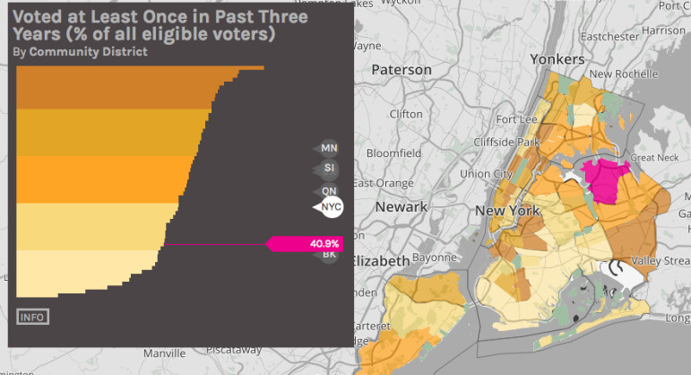
The collaboration between those with the bird’s-eye view data provides and those on the ground who can use the data to make change is essential to ensure that statistics don’t just sit in servers. For his annual State of the District event, for example, New York City Councilmember Robert E. Cornegy, Jr. used Data2Go.NYC to identify some of the strongest assets and most serious challenges faced by residents in Brooklyn’s Bedford Stuyvesant and northern Crown Heights and organized an event as a call for action. The rate of home fires is very high, so he brought in the Fire Department of New York and Red Cross to distribute free smoke detectors. Voting rates are very low, so the district partnered with the NAACP and others to increase voter registration.
Beyond our collaboration with others, the design of the tool is deliberately meant to foster cross-sector collaboration by presenting data from different sectors side by side. A map of public housing locations alone may be informative. But a map of public housing locations overlaid with the prevalence of child asthma hospitalizations can illustrate and give validity to the story many New Yorkers in public housing experience—asthma attacks triggered by mold, cockroaches and decaying infrastructure, and neighborhoods more likely to be located near waste transfer stations, bus depots and other facilities that contribute to poor air, exacerbating the likelihood of an attack. Placing these data on a single platform where they can be overlaid and correlations can be tested encourages users to explore data and collaborate beyond their narrow areas of expertise. What is typically seen as a health issue may be more effectively addressed if it’s also considered a housing issue, for example.
DATA2GO, with its multiple visualization options and 360+ indicators, provides a nuanced palette to paint the pictures of the thousands of New Yorks that make up this great city in factual, detailed ways. Without active, engaged users, DATA2GO.NYC is a passive repository of data. With them, it is a rich, responsive tool for understanding and change-making. DATA2GO.NYC depends on its users engaging meaningfully with the data—bringing knowledge and curiosity, looking for connections, remaining open to learning and challenging assumptions, and most importantly, telling stories.
Data, on its own, does not automatically lead to understanding, let alone to action. Creating connections is what ultimately can leverage the data to bring important social issues to the fore, influence funding decisions, and inform policies for positive change.
Young and Adrift: Measuring Youth Disconnection in America Today
This blog post originally appeared in the Huffington Post on September 26, 2016. You can access the original article here.
Co-authored with Alex Powers, Program Associate at Measure of America and Marina Recio, Program Assistant at Measure of America
In July of last year, a group of over a dozen high-profile companies, including Starbucks, Microsoft, and Walgreens, formed the 100,000 Opportunities Initiative and pledged to hire 100,000 young people not in school or working over the next three years. Last month, the Initiative, which has grown to about fifty leading U.S companies, announced that it had met its hiring goal two years before the deadline.
The quick growth of the Opportunities Initiative reflects a rising concern in America about access to opportunity for young people—or rather, the lack thereof. A wide range of recent initiatives seeks to reconnect teenagers and young adults who find themselves detached from school and work, a group referred to as “disconnected youth” or “opportunity youth.” Far too many young people find themselves adrift, detached from the core institutions that give meaning to our lives and structure to our days. Roughly 5.5 million youth between the ages of 16 and 24 are neither working nor in school, about as many people as live in Minnesota or Maryland. Often these young people carry their scars of disconnection into adulthood, where they take the form of lower wages and marriage rates, worse health, less job satisfaction, and even less happiness.
Across-the-aisle consensus now holds that the social and economic costs of youth disconnection are far too high, for both young people personally affected and for society at large. The first step for action is identifying which young people are disconnected, where they live, and which socioeconomic characteristics and barriers to connection they share. Despite what some may think, disconnected youth are not a monolithic group, and all young people do not face the same risks of becoming disconnected.
While youth disconnection has been measured and analyzed for decades by governments in Europe, where these young people are called “NEETS,” (Not in Education, Employment or Training), the focus in the United States is more recent, and different methods for calculating youth disconnection can sometimes result in seemingly contradicting figures. Ultimately, better measurement means a better chance of success at preventing youth disconnection in the first place and reconnecting those who have fallen out of the mainstream.
Measure of America of the Social Science Research Council has taken a closer look at existing approaches as a first step in this direction. What follows is a guide to the differences and relative strengths of existing data on youth disconnection.
Defining Youth Disconnection
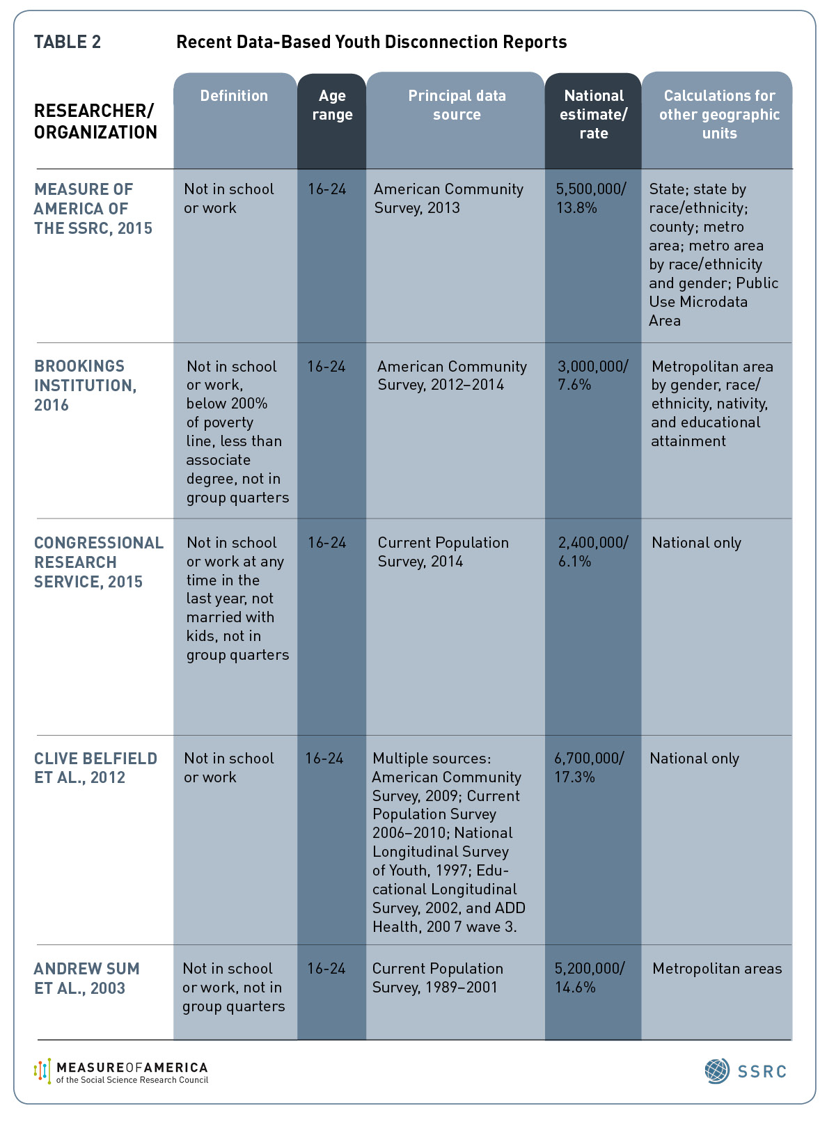
Taking the lead from years of work in Europe, a good basic definition of disconnected youth is this: teens and young adults ages 16 to 24 who are neither in school nor working. This is the definition that Measure of America has used in its data calculations and analysis on youth disconnection since its first report on the topic, One in Seven, published in 2012. It’s also the foundation for most other youth disconnection estimates.
Some researchers have added additional qualifications to this core definition. The Congressional Research Service, for example, in their 2015 report, counted out-of-school-and-work young people who were both married to a connected spouse and parenting a child as connected, given that they engaged in caring labor in the home and were supported by the earnings of a spouse. In addition, they only counted those who were out of work for at least a year as disconnected. The Brookings Institution uses the core definition, but narrows it further to those below 200 percent of the federal poverty line and with less than an associates degree. These qualifications result in significantly smaller estimations of youth disconnection. See Table 2 below for the total U.S. estimate for each of these definitions.
Who Is Considered a “Youth”?
The age range most researchers have used since the 1990s for studying disconnection has been 16 to 24 years of age. Measure of America, Congress, the Congressional Research Service, the Brookings Institution, the Center for Law and Social Policy, and Belfield et al. have used this age range. Other organizations have used a 14 to 24 age range, including a 2008 Government Accountability Office report. The European Union’s standardized definition of their “NEETs” uses the age range 15-24, in large part due to the way their data are collected.
Data Sources
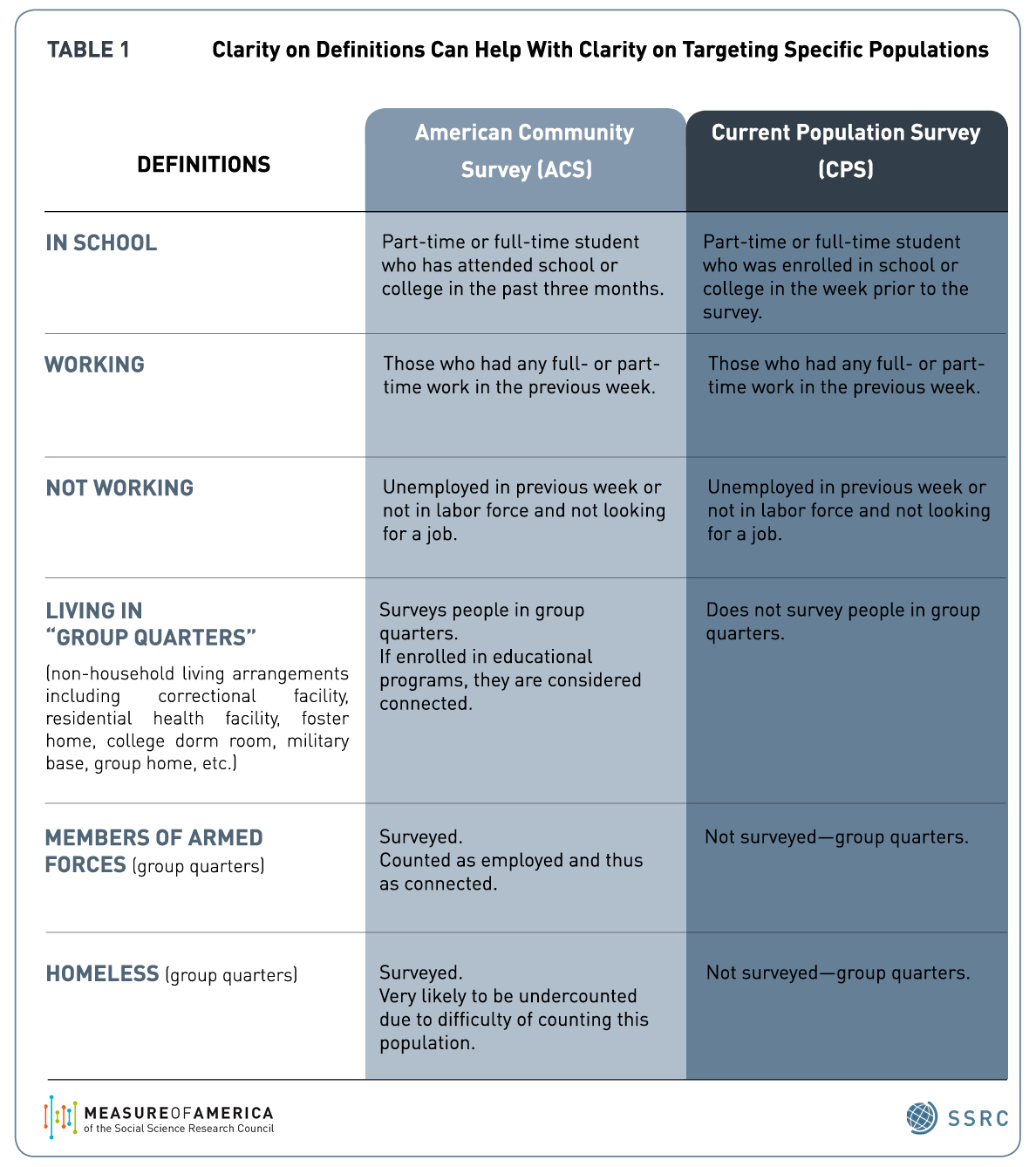
The two main government surveys available for calculating youth disconnection are the U.S. Census Bureau’s annual American Community Survey (ACS) and the Current Population Survey (CPS), which is conducted by the U.S. Census Bureau for the Bureau of Labor Statistics. Using the ACS, Measure of America calculates that there are about 5.5 million youth in the 16 to 24 age range who are neither in school nor working, or one in seven young Americans. Each survey has advantages for understanding the challenges of this population.
The American Community Survey’s main advantage over the Current Population Survey is that the ACS includes a much larger sample size, making it possible to calculate youth disconnection rates in for counties, metro areas, and even smaller geographic areas as well as nationally and by state. It also allows for disaggregation by race and ethnicity and by gender. The ability to disaggregate data can reveal interesting and sometimes surprising insights lurking below national, state or even city-level data—like the impacts of racial segregation on white and black disconnection rates, or the stark inequality in disconnection rates by neighborhoods within large cities like New York.
Another advantage of the ACS is that it surveys young people in “group quarters,”—college dorms, jails and prisons, foster homes, and military facilities; the CPS does not survey those living in these residential facilities. A plus of the CPS is that it is an older survey, with data stretching back to 1940; this makes it possible to look at historical trends. See Table 1 below for further detail.
Conclusion
Lest this roundup leave the impression this is a complex, difficult-to-measure issue, this is not the case. The simple, basic definition and measurement are already a tremendous advance towards making visible a population that has for too long been living in the shadows. The efforts to further striate this population for various subgroups, whether for racial and ethnic groups, teenage boys vs. girls, particular neighborhoods or unmarried young adults, only serves to strengthen our ability to tailor policies and programs to address each group’s particular challenges and needs.
Time to Reform Universal High School Choice
This blog post originally appeared in New York Slant on May 11, 2016. You can access the original article here.
In a bold attempt to break the link between neighborhood conditions and school quality for public school students, New York City launched a universal high school choice program in 2004. The idea was that opening up a wide range of high schools to everyone would give students from low-income neighborhoods access to better schools, and giving families the chance to “vote with their feet” would force low-performing schools to shape up or risk closure.
But in the intervening years, the city didn’t track student performance by home neighborhood, making it hard to tell how well universal choice is working, and for which students. To fill this gap, we gathered data on on-time graduation rates for high school students by their home addresses and mapped them onto the city’s 59 community districts.
We found that location is still highly associated with the likelihood of on-time graduation; meaning students from opportunity-scarce neighborhoods are lagging behind their wealthier peers – regardless of where they go to school.
Disparities in on-time high school graduation rates by neighborhood dwarf those by race, ethnicity and gender, with 34 percentage points separating the best- and worst-performing community districts.
More than 95 percent of students who live in Battery Park City, Greenwich Village and SoHo graduate within four years, compared with just 61 percent of students from Morris Heights, Fordham South and Mount Hope in the Bronx. The largest racial gap in high school graduation rate in the city, though still alarming, is much narrower: 85 percent of Asian students graduated on time last year, compared to 64 percent of Latino students—a difference of 21 percentage points.
Because the city didn’t track these data by place of residence in the past, we can’t assess how different access and outcomes are today than they were in 2004. Even if we had the data from the past, we would be hard-pressed to separate the effects of school choice from the effects of other educational reforms introduced around the same time, such as the shuttering of 29 extremely large, troubled schools.
However, we can use what we know now to begin to assess whether the collective investment in time, stress, and financial resources required of 80,000 eighth graders and their families each year by the high school choice process, not to mention the lengthier daily commutes for high school students, is worth it.
The early evidence suggests that it’s not – at least not for the young people from low-income, black and Latino neighborhoods who still wind up in schools with low graduation rates and classmates who share their socioeconomic disadvantages.
That’s because school access is just one of many factors determining opportunities and outcomes for kids. An analysis of the relationship between on-time high school graduation and other basic socioeconomic indicators using the free mapping and data analysis website DATA2GO.NYC proves that point. Neighborhoods with low on-time high school graduation rates were more likely to have high child poverty rates, low median household incomes and low shares of adults with bachelor’s degrees. Conversely, graduation rates tend to be very high in neighborhoods with low rates of Supplemental Nutrition Assistance Program use.
These findings point to a larger issue: it’s unrealistic to expect a school choice process carried out near the start of high school to remedy the effects of disadvantage, discrimination, and disinvestment years in the making. Making educational equality a reality requires investments in children, families and communities long before children reach ninth grade. The school choice program undoubtedly provides benefits to some children, but it assumes all kids have the resources and supportive adults in their lives needed to help them navigate a bewildering process. This is not the case.
Using these data on high school graduation rates by neighborhood as a baseline, the city should set a goal to slash the gap in graduation rates by community district and make the changes needed to get there. As a start, middle schools need more guidance counselors with smaller caseloads, and students need more good high school options to choose from.
Addressing larger issues of residential segregation by race and income, poverty, the absence of meaningful work, unsafe neighborhoods, lack of political power, and discrimination – challenges that high school students bring with them every morning they commute to high schools in different neighborhoods – is the fundamental educational reform that we as a society must ultimately be willing to make.
Kristen Lewis and Sarah Burd-Sharps are co-directors of Measure of America and co-authors of the study “High School Graduation in New York City” released on May 11, 2016.
How to close NYC’s lifespan gap? The answer may surprise you
This blog post originally appeared in Crain’s New York Business on December 18, 2015. You can access the original article here.
New data reveals a yawning chasm in life expectancy among the city’s residents, with startling implications. While the average life expectancy citywide is 81 years, stunning disparities exist across our neighborhoods. A baby born today in Tribeca can expect to live more than 11 years longer than one born in Brownsville, Brooklyn.
Will Obamacare help? One would think that residents with health insurance would live longer, healthier lives than those without it. After all, insurance helps people afford necessary preventive care, medicine for illnesses, and more. Under Obamacare, New Yorkers must get coverage or face penalties in 2016.
But, surprisingly, the relationship between life expectancy and health insurance across neighborhoods is not statistically significant, according to DATA2GO.NYC, a new public mapping and data website with hundreds of well-being indicators. In fact, the community districts with the lowest percentage of insured adults—Jackson Heights, Elmhurst, and Corona in Queens—have some of the longest life expectancies in the city, around 84 years. In these neighborhoods, only about 60% of adults are covered. In Brownsville, the district with the shortest life expectancy, 80% of adults have health insurance (slightly more than the city average).
Instead, employment is a much stronger predictor of life expectancy in the city. As the unemployment rate decreases, life expectancy tends to rise. While correlation does not equal causation, this connection is compelling and instructive. Unemployment and the economic insecurity it creates can damage health; people struggling with the stress of poverty are vulnerable to premature aging and a higher risk of heart attack, and they are more likely to engage in risky health behaviors like smoking and heavy drinking. Their children are at risk as well: Children who live in economically insecure households tend to have poorer health outcomes than their peers.
These findings don’t imply we should abandon efforts to get more New Yorkers covered by health insurance. Access to doctors and medicine are essential, particularly once you are ill. Rather, they suggest that reducing the massive gaps in life expectancy citywide also requires concerted efforts to address economic insecurity in neighborhoods like Brownsville and Bedford-Stuyvesant.
Employment is one piece of the puzzle that will help improve well-being in neighborhoods like Brownsville. A holistic assessment of New York’s strengths and challenges will help uncover the others.
Sarah Burd-Sharps and Kristen Lewis are co-directors of Measure of America, a nonprofit, nonpartisan research and advocacy initiative of the Social Science Research Council, which created DATA2GO.NYC with a grant from The Leona M. and Harry B. Helmsley Charitable Trust.
From Foreclosure to Homelessness, Now You Can Map NYC’s Problems
This blog post originally appeared in City Limits on December 1, 2015. You can access the original article here.
New York City is rich in data resources for understanding the unique assets and challenges of its diverse neighborhoods. But the information available isn’t necessarily comprehensive, up-to-date, easily accessible, or in the right format, so finding the right data and corralling it into something useful can be a challenge. To make a real impact, policymakers, social service organizations, and advocates working on improving policies and programs need reliable, nonpartisan information to understand how a variety of issues interact to shape people’s choices and opportunities – which is why we created DATA2GO.NYC.
DATA2GO.NYC brings together for the first time federal, state, and local data vital to understanding inequality and how multiple factors combine to influence New Yorkers’ well-being in every neighborhood. It’s a free tool for policymakers, community-based organizations, philanthropists, social service delivery agencies, journalists and all people working to improve life in the Big Apple. The website contains 350 indicators of well-being for each of New York City’s 59 community districts, 150 of which are also available by census tract. Many indicators were previously unavailable to the public, such as data on homelessness and philanthropic giving, or unavailable by community district, such as data on crime and voting. Users can create unique maps and visualizations, prepare community district profiles, test relationships between indicators across neighborhoods, and print or share their results at the click of a button.
A chart generated by DATA2GO.NYC on political engagement.
This makes it possible to ask and answer questions like “Is there a connection between health insurance and life expectancy in New York City?” or “Which factors intersect to make the life of a child born in Brownsville different than that of a classmate born on the Upper West Side?” The tool is designed to draw new connections across sectors to delve deeper into New York City’s challenges, providing new insights for better, more effective policies and programs.
Take, for example, the ongoing foreclosure crisis among black and Latino households. To explore how foreclosures continue to affect New York City residents, we used DATA2GO.NYC to identify factors related to high foreclosure rates across community districts. In 2009, at the height of the housing bust, foreclosures swept through the city, spiking to an astonishing average of 24 foreclosures per 1,000 properties. The highest rate was in Bushwick, Brooklyn, which saw 61 foreclosed one-to-four family homes per 1,000 properties. The average has since declined to 17 foreclosures per 1,000 properties in 2014. This positive trend, however, masks a highly uneven recovery.
The problem remains stubbornly prevalent in districts with large black and Latino populations. The community districts with the top five foreclosure rates in 2014 are all areas where more than four in five residents are black or Latino. These were Bronx CD 4 (Mt. Eden, Highbridge, West Concourse, East Concourse, and Concourse Village), Brooklyn CD 16 (Ocean Hill and Brownsville), Bronx CD 5 (West Tremont area, South Fordham, University Heights, Morris Heights, and Mount Hope), Brooklyn CD 5 (parts of Broadway Junction, City Line, Cypress Hills, East New York, Highland Park, New Lots, Spring Creek, Starrett City) and Queens CD 12 (Hollis, parts of Jamaica, Jamaica Center, North Springfield Gardens, Rochdale, South Jamaica, St. Albans).
The higher the share of blacks and Latinos in a community district, the higher the foreclosure rate was in 2014. Even after holding median household income constant, the shares of black and Latino populations in a community district still had a significant relationship with foreclosure rates. What is most surprising is that despite the overall recovery, many neighborhoods with high concentrations of black and Latino residents have higher foreclosure rates today than in 2009, at the height of the housing bust and foreclosure crisis.
Owning property in New York City is a dream that many residents never realize. Losing a home after investing so much capital can set families back generations, particularly for black and Latino families who invest larger proportions of their overall wealth in primary homes. The mortgage crisis is clearly not over for them. To avoid the destabilizing impact of foreclosure, greater enforcement is needed in the mortgage servicing industry to protect families of color from predatory lenders. Further reforms should focus on incentives for inclusive lending and reductions in racial and ethnic discrimination in the mortgage market. Reducing rates of foreclosure could allow families to protect their chief assets, build wealth, and promote neighborhood stability, all of which also save the city money in the long run.
We created DATA2GO.NYC to catalyze improvements in policy-making and philanthropy and boost well-being across the five boroughs. How will you use it?
Sarah Burd-Sharps and Kristen Lewis are co-directors of Measure of America—a nonprofit, nonpartisan research and advocacy initiative of the Social Science Research Council—which created DATA2GO.NYC with a grant from The Leona M. and Harry B. Helmsley Charitable Trust. Measure of America statistician Andy Garon contributed to this article.
Reconnecting Youth in America’s Cities
This blog post originally appeared in the Stanford Social Innovation Review on July 2, 2015. You can access the original article here.
For many young people, June is a month replete with excitement and promise. Graduating seniors toss their mortarboards skyward, college kids kick off summer jobs and internships, and newly minted college graduates join the working world in earnest. But for teens and young adults who have dropped out of school or failed to gain a foothold in the labor market, June, like the rest of the year, offers few encouraging opportunities.
These “disconnected youth”—young people between the ages of 16 and 24 years who are neither working nor in school—are unmoored from the jobs, training programs, and academic institutions that anchor and give shape to the lives of their connected counterparts. Absent the experiences and supports that school and work provide, disconnected youth struggle to acquire the skills and credentials they need to live rewarding, freely chosen lives as adults. Youth disconnection stunts human development, with adverse impacts on the affected young people themselves as well as on the economy, social sector, and criminal justice system, and in the political landscape.
According to our recent research, there are 5,527,000 disconnected youth in America today, or nearly 1 in 7 young adults (13.8 percent)—about as many people as live in Minnesota and more than the populations of 30 states.
Though the rate of youth disconnection has fallen since the Great Recession (roughly 280,000 fewer young people are disconnected today than in 2010, the last decade’s peak), the numbers are still higher than pre-2008 levels. And even leaving aside the costs of wasted potential, our society spends billions each year on disconnected youth—a conservative estimate of just some of the direct financial costs tallies $26.8 billion for 2013 alone.
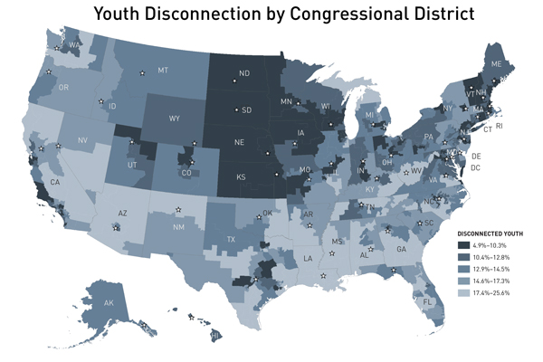
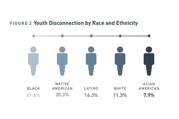
Among the 98 major metro areas we studied—home to two in three Americans—disconnection rates range from less than 8 percent in the Omaha, Nebraska, and Bridgeport, Connecticut, metro areas to more than 20 percent in greater Lakeland, Florida, Bakersfield, California, and Memphis, Tennessee. Nationally, youth disconnection rates for blacks (21.6 percent), Native Americans (20.3 percent), and Latinos (16.3 percent) are markedly higher than rates for Asian Americans (7.9 percent) or whites (11.3 percent). In nine metro areas, at least one in four black youth are disconnected; in 10 metro areas, at least one in five Latino youth are. Clearly, youth disconnection is a complex and highly variable issue. What can we do about it?
First, what won’t work: laying the problem at the feet of disconnected young people themselves and expecting them to solve it on their own. To alter the trajectory of his or her life, a young person needs perseverance, the optimism to envision a better future, and the willingness to work toward it. But disconnected young people face challenges far beyond what they can tackle through sheer willpower. Disconnection is not a spontaneously occurring phenomenon; it is an outcome years in the making. These young men and women tend to come from segregated, historically disadvantaged communities, and their struggles with education and employment too often mirror those of their parents and neighbors.
A meaningful starting point would be for cities to adopt the goal of cutting in half the wide gaps between racial and ethnic groups within their metro areas. In Chicago, for example, 17 percentage points separate the youth disconnection rates for blacks (24.5 percent) and whites (7.5 percent). Halving that black-white gap to 8.5 percentage points within five-to-seven years is an ambitious but achievable goal. Governments, businesses, schools, and nonprofits should join together to establish measurable, time-bound, tailored targets like this one, as well as blueprints for meeting them. Setting customized targets in metro areas across the country and working in concert across sectors to meet them would make the plight of these young people visible at a more local level while also moving the needle on the national problem.
Over the long term, meaningful progress requires preventing disconnection in the first place. A growing body of research suggests several cost-effective preventative investments:
- Helping at-risk parents give their children a good start through programs like the Nurse-Family Partnership
- Prioritizing universal, quality preschool, which imparts the social and emotional skills necessary for success later in life, and is associated with fewer behavioral problems, higher high-school graduation rates, less crime, fewer teen births, and higher wages and rates of homeownership
- Improving K–12 education in neighborhoods with concentrated poverty and under-resourced schools, including offering services to address the emotional, health, and financial challenges young people bring with them into the classroom
- Creating diverse pathways to meaningful careers through apprenticeship and mentoring programs like California’s Linked Learning, which provides high-school students with real-world job experience, experiential learning, and connections between high schools, community colleges, and local businesses
- Boosting civic engagement, which research shows cuts the likelihood of disconnection nearly in half
- Addressing residential segregation by race; our research showed that, in highly segregated metro areas, black youth tend to have higher-than-average rates of disconnection
America spends too much time, money, and effort fighting the consequences of youth disconnection—and too little preventing it. Long-term solutions that improve conditions in disconnected, opportunity-scarce communities, knit these communities into the fabric of the larger society, and create meaningful pathways to adulthood within them is the answer to youth disconnection. Easier said than done, we know. But all of our country’s young people deserve a meaningful shot at their own American dreams.
Community Action from Shared Understanding: A Case Study in Sonoma County
This blog post originally appeared on Spotlight on Poverty and Opportunity on June 30, 2015. You can access the original article here.
Sonoma County is a thriving northern California county known for world-class vineyards and breathtaking vistas as well as rich cultural diversity and the entrepreneurial spirit of its residents.The county is also home to a vibrant web of community organizations dedicated to making it a better place. But Sonoma County residents recognize that their communities – like so many across the nation – face the difficult reality of deep disparities in access to opportunity.
Most Americans see the gap between the rich and the poor as a problem. But reasonable people who are concerned with the growing divides in the United States can, and do, disagree about how best to address them. At Measure of America, a project of the Social Science Research Council, we have found that by creating a common frame of reference about the nature, extent, and consequences of inequality, it is possible to mobilize broad coalitions to improve human development outcomes.
Aiming to confront disparities head on and develop a detailed roadmap to address them, the Sonoma County Department of Health Services commissioned Measure of America to produce A Portrait of Sonoma County in late 2013.
The report found that although Sonoma County overall scores well on the American Human Development Index – a composite measure of health, education, and income – outcomes in these areas are highly uneven. In some communities, residents enjoy long lives, very high levels of educational attainment, and earnings more than double the national median; in others, residents struggle to meet their most basic needs.
Crucial to its success was a collaborative process to support the report’s development, dissemination, and implementation. The report concludes with an “Agenda for Action” that outlines concrete recommendations for addressing the county’s greatest challenges and identifies high-priority neighborhoods. Seventy-five organizations and individuals signed a “Pledge of Support” committing “to using A Portrait of Sonoma County to better understand … gaps in opportunities and to partnering with the community to identify the strengths and assets on which to build a comprehensive and inclusive response to this report.”
County leaders agree that, one year after its launch, the Portrait has become the gold standard for data on need and well-being in Sonoma County. Evidence-based attention to racial and ethnic disparities is leading to conversations about the reality of de facto segregation, and the Board of Supervisors’ official acceptance of the report has spurred municipalities and agencies to put human well-being progress on the same level as infrastructureand other priorities. In the words of Alfredo Perez, executive director of First 5 Sonoma , “You can’t go to a meeting in the community without the Portrait of Sonoma being talked about.”
The shared understanding has been instrumental in catalyzing advocacy and policy changes to promote greater equity:
- County agencies have agreed to concentrate and coordinate substantial resources in the five communities identified in the Portrait as having the highest potential to move up the Human Development Index.
- Shortly after the report’s publication, the County Board of Supervisors voted to regulate e-cigarette use, citing the Portrait’ s findings on high teenage tobacco use in the county as an impetus for new limitations.
- The report prompted the formation of a funder’s circle that is coordinating the efforts of community and private foundations, hospitals, and the county government with an eye towards finding projects that they can collectively throw their support behind.
- Following the Portrait ’s recommendation to “make universal preschool a reality,” the Board of Supervisors requested a cost estimate for this program. Policymakers estimated requiring $70 million for instruction and facilities, and the board is exploring financing options for the county’s first-ever universal preschool program.
- A pilot program has begun, with the bottom-ranked census tract on the index as the first site, to create a series of murals aimed at community engagement and healing. The goal is to use public art as a means for improved local law enforcement-community relations and to tap into cultural assets in underserved areas.
How can we take the experience of Sonoma County and replicate it at scale? First and foremost, legitimacy is key: community and government involvement foster legitimacy. Data-driven change also relies on accessibility and transparency. Accessibility means communicating findings in plain language (whether it be English, Spanish, or another language) and ensuring that inequality is defined in a non-contentious way that people can relate to.
Transparency consists of explaining data sources, calculations, and goals—and giving the data used to produce any analysis to the public, free of charge. And social change requires real partnerships across sectors and political divides.
As the Portrait Pledge of Support states, “only by working together as equal partners with a shared vision and common agenda can we hope to achieve our long-term goals of making Sonoma County the healthiest county in the state for our residents to work, live, and play.” The report and its adoption by Sonoma County can serve as a model for other cities, counties, and states looking to improve the wellbeing of their citizens.
Two Americas: A Better Way To Measure How We Are Really Doing
This blog post originally appeared on Cognoscenti, a blog of WBUR, Boston’s NPR station on June 4, 2015. You can access the original article here.
There’s a problem with our conception of progress in America: It’s based on money and not much else. We hear a lot about economic indicators like the trade deficit, or the price of oil, or stock-trading volumes, but relatively few people know that young adults in Abington, Brockton and Avon are six times as likely to be disconnected—neither working nor in school—as their counterparts in Allston or Brighton, or that an African-American baby born today can expect to live, on average, 11 fewer years than an Asian-American baby born today.
Economic indicators like gross domestic product (GDP) provide important information, but using them as proxies for societal progress paints an incomplete and often misleading picture. For instance, from 1974 to 2013, America’s GDP grew by more than 200 percent—but during that same time, the relative child poverty rate also grew, from 20 percent to 30 percent. So while we should celebrate New England’s post-recession economic growth, we also must look beyond the marquee numbers to see how this growth is, or isn’t, translating into better lives for people.
The American Human Development Index (HDI) is a better way to think about and measure progress. It combines indicators on three basic building blocks of a good life: health, education and income. And it expresses the result on a zero-to-10 scale. Based on a conceptual framework developed by Harvard’s Amartya Sen and adopted by the United Nations, the HDI enables communities to understand where they stand relative to others, shines a spotlight on opportunity gaps, and helps identify solutions.
Using the American HDI, we ranked the 435 congressional districts and Washington, D.C. Our analysis revealed astonishing inequalities within regions and states, even in parts of the country that are doing well overall—like New England, which ranks first in terms of well-being among nine Census Bureau-defined regions in the U.S.
What do these rankings mean on the ground, and why do they matter? Compare, for example, New England’s top- and bottom-scoring districts: District 5 in Massachusetts, containing the suburbs north and west of Boston, and District 2 in Maine, a largely rural area covering a majority of the state’s land, and the only one in the region that scored below the national average.
A baby born today in Massachusetts’ District 5 can expect to live, on average, 81.6 years—more than three years longer than a baby born today in Maine’s District 2. The Massachusetts baby—let’s call her Emma, the state’s most popular name for girls in 2014—will grow up in a region in which more than half of all adults have completed bachelor’s degrees, more than one in four hold graduate degrees, and median personal earnings are about $42,000 (about $12,000 more than the national median).
Our Maine baby, little Olivia (Maine’s second-most popular name for girls in 2014), will grow up in a place where far fewer adults, about one in five, have bachelor’s degrees, and where median personal earnings are about $25,000, roughly $5,000 less than the national median.
Higher shares of college graduates in a place are associated with better educational outcomes for children, more economic growth and higher wages, even for those without college degrees. In addition, children whose early years are spent in economically stressed households tend to have worse health as adults than children who grow up in more affluent families. In other words, Emma is likelier to enter adulthood with a good education, find a job, earn higher wages, and even enjoy better health than Olivia.
The HDI shows how disinvestment and neglect have left whole communities behind, especially when it comes to education, health, civic engagement and real opportunities open to young people. For example, compared to children in the suburbs, children living in urban neighborhoods are much more likely to live in poverty, be exposed to safety and health risks, and attend overcrowded, underfunded schools where they feel unsafe, where teachers have high rates of absenteeism, where behavioral problems disrupt learning, and where achievement levels and graduation rates lag.
Though recent national dialogue around income inequality is a step in the right direction, we also need to examine the other ways in which people in America experience opportunity — or the lack of it. Why are young adults in one area six times as likely to be disconnected from both school and work as those just across town? Why should people in one district outlive their neighbors in the adjacent district by six or seven years?
To answer these questions, we need to take an honest look at how and where we are allocating public resources. We also need to rely on indicators that focus directly on people and the real opportunities they have to live rewarding, productive, freely chosen lives. Just some of the ways we can begin to address these inequalities include creating programs that fight the biggest contributors to preventable death in the United States: smoking, poor diet, physical inactivity and excessive drinking; supporting high-quality universal preschool programs; providing more young people access to higher education; helping students complete their degrees; and ensuring that all jobs offer decent wages, economic security and dignity. By including health, education and income in defining a good life, we can more accurately measure progress, and we can begin to drive real change, in New England and across the country.